Minimalist Infographic
Turn any complex content into crystal-clear infographics. Design like a pro, ensuring your message is visually quiet yet powerfully impactful, guiding your audience effortlessly.
提示词详情
Design an **Infographic** to explain [Topic & Content] to [Target Audience: e.g., "non-specialist managers / general public / junior engineers"], rendered in a **clean, clear, pleasing, and visually quiet** style.
### 1) Information Structure & Hierarchy (Emphasis & Hierarchy)
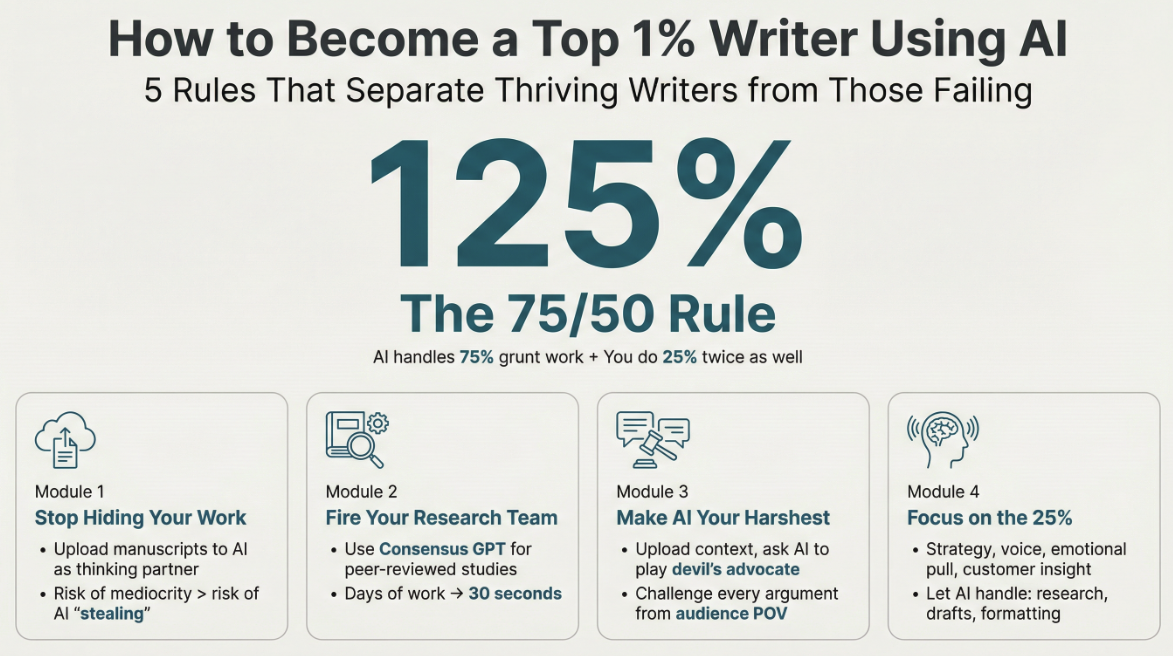
- **Top:** A **main headline** (one sentence summarizing the key takeaway), followed by a **subheadline** (providing context, scope, or date).
- **Middle:** Feature **one critical number or conclusion** as the visual anchor (largest font size / largest block)—the viewer should instantly know what matters most.
- **Bottom:** Break content into **3–5 modules** (each with a sub-header + 2–3 bullet points, kept as short as possible).
- Establish clear hierarchy through **font size / weight / whitespace / positioning**: Headline > Key Conclusion > Module Headers > Body Points.
### 2) Scale & Proportion
- The key conclusion block should be noticeably larger; other modules decrease in size by importance.
- Balance graphics and text proportionally—avoid making all elements the same size, which creates "no focal point."
- Use a grid system (e.g., 12-column grid) with consistent spacing to achieve visual harmony.
### 3) Contrast Without Excess
- Use only **one high-contrast accent color** to highlight "key conclusions / critical paths / CTA-style labels"; keep all other colors low-saturation and softly neutral.
- Create contrast through *difference*, not *loudness*: size contrast, weight contrast, value contrast, shape contrast.
- Avoid multiple high-contrast elements competing simultaneously—this creates visual noise and chaos.
### 4) Repetition & Pattern
- Apply a unified card style across all modules: same border radius, margins, header styling, and icon treatment.
- Icons should share consistent stroke width and style (choose either line or flat, not both); maintain uniform layout within modules (icons consistently left or top).
- Use repetition to establish order and scannability.
### 5) Balance, Alignment & Whitespace
- Leave ample whitespace—let the information breathe; don't fill every inch.
- Align rigorously: baseline-align headlines, edge-align cards, left-align body text, and adhere to the grid throughout.
- Balance visual weight: pair heavy information blocks with lighter elements (thin rules, muted annotations) to counterbalance.
### 6) Movement & Visual Flow
- Organize content along a **clear reading path**—top-to-bottom or left-to-right (e.g., numbered steps 1→2→3, subtle arrows, progressive sizing).
- Rhythm comes from *intentional repetition and spacing*, not flashy effects; guide the eye naturally through the composition.
### 7) Typography & Readability
- Limit to **2 font styles max** (or different weights of a single typeface); avoid decorative fonts.
- Body text should be large enough with comfortable line spacing; keep each point to 1.5 lines or less (favor brevity).
- If technical terms are unavoidable, include a one-line plain-language explanation or annotation.
### 8) Output Specs (adjust as needed)
- **Canvas:** [Aspect ratio 16:9 ], Resolution: 1K
- **Style:** Modern minimalist, fresh, lightweight, vector-like aesthetic; subtle or no shadows; avoid heavy gradients and intricate textures.
- **Background:** Solid color or very light tint—should never compete with the content.
**Negative Constraints:**
No cramped layouts • No more than 1 accent color • No multiple high-contrast blocks fighting for attention • No decorative patterns or noise textures • No more than 2 typefaces • No equal visual weight across all modules • No misalignment.
**Topic & Content:**
ask user to provide so you can analyze
---
You don't need to ask user the target audience, the goal of this infographic is to help user to learn a subject fast and great.
{"image_generate": {"model": "gemini-3-pro-image-preview", "use_tool": "required"}}
应用场景